
I don’t like to mess with something that’s working for me. If looking like a scruffy pound pup moves people to bring me inside and feed me, I’m not going to change just for the sake of dignity. If I’ve racked up 57 years of continuous air breathing, I don’t want to take up scuba diving. Even more adamantly, I will not change anything related to my computer if I’ve figured out a way to make it work. I may have done the equivalent of taking a document, walking it into a room, getting out the step-stool, hauling the box off the top shelf, grabbing a sticky label and applying it to the document, running around the yard three times and plopping it in the tool shed, but that’s where I’ll find it again. Don’t start telling me I can hit two buttons and shoot it into a safe deposit box a foot away. I don’t want to know.
 |
| Visual Park Bench #1 |
So what does my nice host site Blogger do but start making all kinds of template choices available to me? I hate choice. Choice is why we never get out of the grocery store. Choice is why it’s almost certain that the latest whiz-bang electronic device we bought was the wrong one. Choice is the enemy of happiness.
Until recently, when I wanted to post a new piece on Murrmurrs, I went to the front door of the site like everyone else and used my key and went straight to the study and cranked one out. Now, thanks to Blogger, I can still get to the study, but not without going through a giant foyer with pretty pictures down the sides. “You can have one of these!” the butler says. “Any one you want! Any color you want!” I’d smack the butler and push on to the study. Finally, one day, I stopped to glance at the pictures.
There are about five new templates with lots of opportunity to re-jigger. Things get bigger, wider, pinker, brighter, right in front of your eyes. I like my old template. And I really hate messing with something that already works. Last time I tried to take a screwdriver to my template, my whole site blew up. You probably heard it from there. Why would I change?
Because it’s fatter, and I’ve put a lot of mental capital in the notion that fatter is better.
 |
| Visual Park Bench #2 |
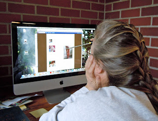
When I picked out this template, there were about a dozen choices. Mine jumped out at me. It was conservative, stately, a little rumpled, didn’t put on airs. It had a name that I do not recall, but it might as well be called “Old Fart With Writerly Aspirations.” If you do a casual cruise on the blogosphere and loop into a groove with a lot of author types, you’ll see this template a lot. We’re drawn to its old-parchment body. Spinster-lady wallpaper drapes down its sides. The blinds are always drawn, and the air is redolent of old books, African violets, medicine, and a little pee. No one with this template is planning to wow anyone with graphics. We are serious wordsmiths, and we don’t want anything distracting people from our literary pearls.
Most do not even hang up pictures on their writerly sites. I do, because I worry that if I creep past 600 words a post, my audience will panic and click off. The photographs are little visual park benches. Folks can rest up and then find the stamina to push on to my last, perfect word. I think it’s working for me. So why would I change?
 |
| Visual Park Bench #3 |
It’s the damn wallpaper. I like it, but I have to squeeze every last thing in a narrow curtain down the center of the page. If a bigger photograph crowds my paragraphs, the words dangle down the edge like they’re Chinese. My sidebar is smashed thinner than a passenger on the window seat. It looks like I don’t even care about my blogroll. We don’t want to put too much pressure on those Poop Posts.
So I’ve been tinkering with the new templates. I’ve tried to jigger most of the color and flash out of them. I haven’t succeeded in getting them dull enough yet; we may be stuck with the wallpaper and parchment. If anyone has an opinion, hang it off the hem here, but try not to blow anything up.
"Old Fart With Writerly Aspirations." That would be me, too. I think a word is generally worth a thousand pictures. And I use this same template.
Ah yes, I also use this template for much the same reasons. And also because it looked kind of earthy to me. As for the new templates, I might have given them a try but couldn't figure out how. As for change, you've nailed it. I hate change – and I won't change by changing my mind!
You are right, of course Murr. I just couldn't help myself when I saw the new templates and went to one right away. I messed with it a lot, and found that I could make it do all the things that I needed, and then I found that I could change the background to a beautiful blue picture of mountains. Now I don't mess with it at all. That's the way it must have been for you when you started this one. It looks like you, after all!!!
Nobody puts Pootie in a visual park bench!
You hit the nail right on it proverbial head. I chose this template for all the same reasons, although I did have a friend futz with it to create a left and a right sidebar so it's fatter now and I can put up more stuff. Not that I'm sure more stuff is better, because in the end it's the content that counts. My plain brown wrapper is just fine for me.
Well, I haven't changed my template in about 7 years, so I've got no standing, but… this is a little dowdy, Murr, to tell the truth. You do look around for the antimacassars and the lace doilies when you sit down here.
Not that it matters, when the writing is so wonderful. Bring on the hairnets!
It IS dowdy. But let's not stop with the hairnets. I want to engineer the site so that there is a little loose bloopy fart sound every time people click off.
visual park benches! I love that!
Those new templates are great – and I would think they have enough dowdy colors to please even the frumpiest among us.
When you get to be of middling years with eyes that are iffy about focusing, busy visual hoopderah becomes the equivalent of listening to some guy with a poor command of English hip-hopping his verbs off on the loudspeakers at the gym in an incomprehensible bafflegab of noise.
Dowdy? Legible. And I for one thank you. I come here to read what you have to say, not for the pyrotechnics. The fart I wouldn't mind.
Thanks, Tiffin. Older I get, the sparer I like things. Did you know that some restaurants have engineered their acoustics so that everybody's conversations ricochet off the walls? On purpose? The young people find it energizing. The old people go away scowling, little loose bloopy farts following them out the door. Everybody's happy.
ilikebusyvisualhoopderah
witnessmyblog
theladydothprotesttoomuchmethinks
goforitdahlink
whatdoyouhavetolosebuttheantimacassar?
It's gotten to where even the Spammers are starting to insult my blog design. I'm not changing and do you know why? Because Blogging is about WORDS. And nothing makes me want to stick a fork in my eye faster than website with music and flashing lights, etc. I don't even have ADS (yet.) Design Curmudgeons unite!
Julie said butt!
If it ain't broke, don't fix it! You shine without dancing floozies and hoopla. Write on, woman! Elaine
PS – I like seeing Pootie on the park benches, he's familiar now, and always seems so well dressed.
Hey, I'm also changing my template or whatever it's called. I hate it because I get overwhelmed by all the choices and then nothing looks right and I end teary eyed and depressed.
Making sure nothing blows up is a wise first move.
Hey, your current design is perfect. If it ain't broke, don't fix it. Just show these pushy template salesmen the door.
I can't leave things alone. As soon as I know you can make custome changes to something, I start customising, but get frustrated at the limitations. If you can turn the background red, green or blue, then someone else will have already done it, so I want to go in and figure out how to make it silver.
I didn't want my blog looking like anyone else's. Although I fear I might have gone overkill with mine…
My God — THIS IS ME!! When I've gone to the trouble of picking out a paint, opening up the can and slapping it on the walls, it's pretty much going to be there forever.
And yes — 'Old Fart With Writerly Aspirations' is absolutely what drew me to this template, and anybody who wants me to change it will have to push past my dead body. I figure this whole blogging thing is all about the words. If I can get those right, I'm happy. And when my kids and younger, more creative types (like Kim above!) show me those pretty things, I just go 'Lalalalala' until they stop.
I've gone much plainer on my new site. Perhaps, I'll spruce it up a bit for Christmas.
======================================
I am now blogging over at The AC is On
*snort* I changed my template recently to that orange bright thing, but it's starting to seem to bright to me. But that means I have to change it. Which means figuring out what else to do. Which means Change and Choice. So orange stays for now. I like the look of your blog. This comment was supposed to be witty in some way, but instead I seem to be babbling. Thanks for stopping by my blog and leaving a happy nano comment (I'm totally counting all these words by the way 🙂
good to meet you Ms. Murr,
I like your "templete" just fine.lol.. actually it lookg a lot familiar. Thanks for jumping over to my site. You are invited to visit anytime and with your permission, I would like to come back to your front porch also..glenn
Since this is the same template I use, I can only admire your taste. I'm sure you noticed when you popped over to my site. Thank you by the way for a very funny comment.
I might change someday but I do enjoy comfort and this gives me that. I put up with the chinese lay out when posting pictures.
Sometimes the templates are so colorful and interesting, you forget to read what is on them.
Ours will never be guilty of that. Enjoy.
Great minds think in similar fashion. I've used this temp and it's right for me for this blog. But I've 'spread my wings' to learning newer ways where the function is to work with photos. For that I've got a second blog. Photo blogs do a have a place too. I love the teddy pics. And thanks for your insight on driving while having had a colon prep. One is not medicated so it is not dangerous. The point of that post was a key adventure.
I had a template I liked fine and then things went seriously wrong. My software genius husband did something and I ended up with a new template. I don't know what he did or where it came from and I don't even want to know. I'm not a technical person. I like your template just fine.
'Scuse me, but I laughed so hard that I think I need to open a window in here and give my chair cushion a little shot of Febreze. I really must remember that your blog is very often NSFW. Please don't change the wallpaper or the style. It's quite fine as is. In fact, I have a chair with that very same pattern in the upholstery, but it's green. Come to think of it, I probably should put an antimacassar on it. I believe I have some around…somewhere.
Well your template certainly makes me feel at home, especially the faint odour of urine. I picture myself rolling it with one of those sticky-tape rollers that pulls up animal hair before settling in to read. (Ahhhhhh…..)
57 years isn't too old to change, just a little bit maybe. I'm at the half century mark my ownself and found the new blogger templates to be a joy to work with and easy as pie…3.14.
It's very simple to do, very now, and it won't make you look like you're stuck back in the gramma days of the luddites. Your kids and grandkids and maybe some readers may notice the change, the make-over, the re-modelling and like the meta-morphisis.
Just a thought from someone who did change and likes her new Blogger template.
Oh and one last thing. Don't worry about your old stuff disappearing, it just re-configures in a new place on your blog.
You have to know that sooner or later, blogger, like ALL software whores will FORCE you to change by eliminating the features that you 1. like, and 2. depend on.
I used to write on Word Perfect. Gone! I do my checking account on a flat-file DOS-based database called Paradox. Gone! I managed to find a "DOS emulator" program so I can still balance my checking account.
Software engineers know that if they don't keep changing things they are out of a job. That's why it now takes a high-end super computer for me to check my e-mail.
I like your hair. That's my comment.
I like your comment. That's my comment.
I'm a stick in the mud when it comes to templates. I use just a plain color background (black for the first one then a charcoal gray, and now a grayish purple. That's me, always living dangerously! I also, once I've made a photo I've taken into a banner, I never want to let it go.
I retired from teaching computer literacy. I never could figure out why my kids were obsessed with fonts. They would spend WAY more time deciding on the font than thinking about their message. Then I found a study that showed that kids live in a graphic age while we old farts like in a textual age. Pictures used to enhance our writing. Now our writing enhances the picture. And the colors, layout, white space – that's a real biggie – and yes the font, convey the background emotion and feel. So the colors/patterns are another way to convey a sense of yourself. And the new generation blogs too and needs lots of patterns and colors. Humm, I think maybe I to do even though I'm way older than you, Murr. Maybe that's way my entire condo was in faux.Wonder if my blog needs changing?
Nah. Let's stay old farts together.
Nah. Let's stay old farts together.
You have to know that sooner or later, blogger, like ALL software whores will FORCE you to change by eliminating the features that you 1. like, and 2. depend on.
I used to write on Word Perfect. Gone! I do my checking account on a flat-file DOS-based database called Paradox. Gone! I managed to find a "DOS emulator" program so I can still balance my checking account.
Software engineers know that if they don't keep changing things they are out of a job. That's why it now takes a high-end super computer for me to check my e-mail.
Hey, I'm also changing my template or whatever it's called. I hate it because I get overwhelmed by all the choices and then nothing looks right and I end teary eyed and depressed.
When you get to be of middling years with eyes that are iffy about focusing, busy visual hoopderah becomes the equivalent of listening to some guy with a poor command of English hip-hopping his verbs off on the loudspeakers at the gym in an incomprehensible bafflegab of noise.
Dowdy? Legible. And I for one thank you. I come here to read what you have to say, not for the pyrotechnics. The fart I wouldn't mind.
Ah yes, I also use this template for much the same reasons. And also because it looked kind of earthy to me. As for the new templates, I might have given them a try but couldn't figure out how. As for change, you've nailed it. I hate change – and I won't change by changing my mind!